Overview
This case study focuses on designing a responsive web app for the existing “Foodies” food delivery mobile app, as described in this case study.
It targets customers who prefer devices with large screen sizes (laptops, tablets or desktops) to mobile devices.
The Problem
Some people prefer devices with large screen sizes for online activities.
The Goal
Design a food delivery responsive web app that allows users to easily order healthy meals and get it delivered at their doorstep.
My Role
UX designer designing a food delivery responsive web app from conception to delivery.
Responsibilities
Conducting interviews, paper and digital wireframing, low and high-fidelity prototyping, conducting usability studies, accounting for accessibility, and iterating on designs.
User research
I conducted interviews and created empathy maps to understand the users’ problems. The primary user group were people who preferred devices with large screen sizes for online activities.
This user group confirmed initial assumptions about potential customers. Research also revealed that apart from screen size, the availability of a mobile device was also a factor limiting users from using the mobile app.
Pain points
Accessibility
Either the target users don't have access to a mobile device or have difficulties using one.
Persona
 Pratyush
- Make time for each of his patients
- To have easy access to healthy food
- Having a busy schedule makes it difficult for him to prepare a meal
Starting the design
Wireframes
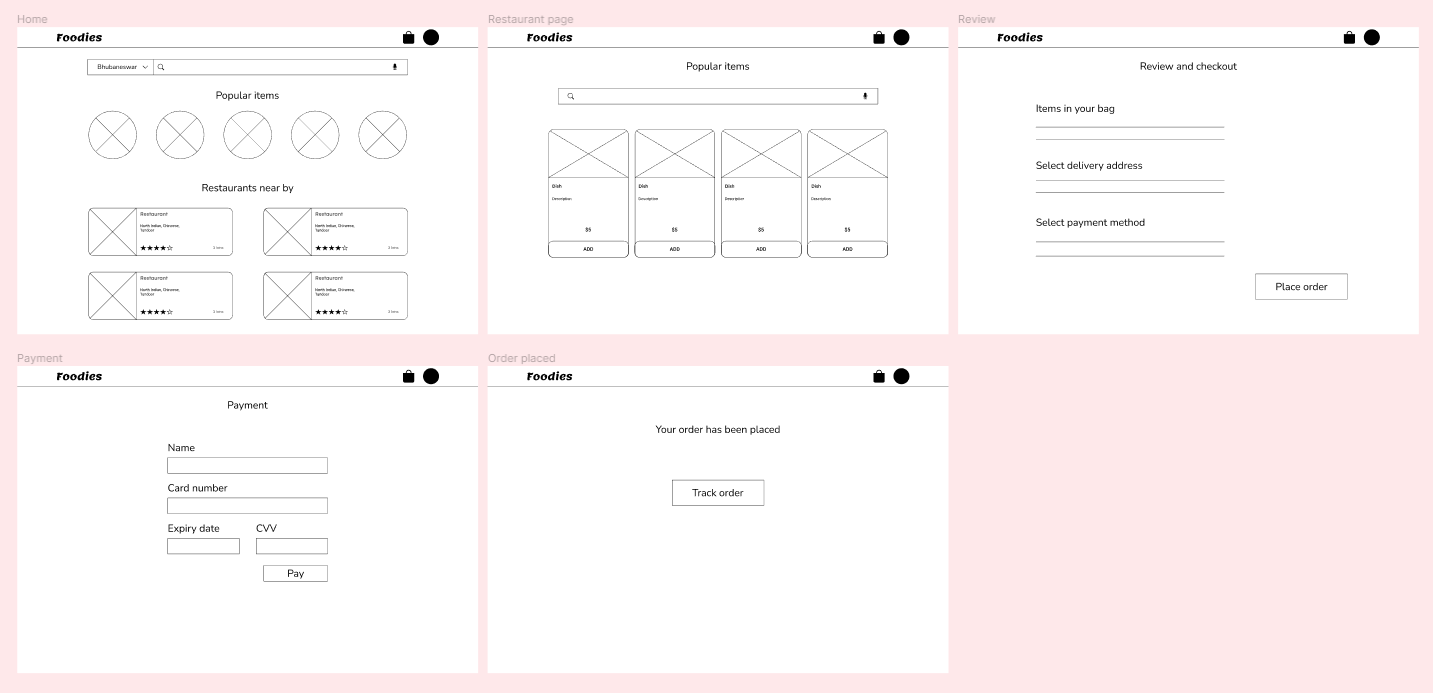
Low-fidelity prototype
Using the completed set of digital wireframes, I created a low-fidelity prototype. The primary user flow was to select a restaurant and order food. This prototype was used in a usability study.
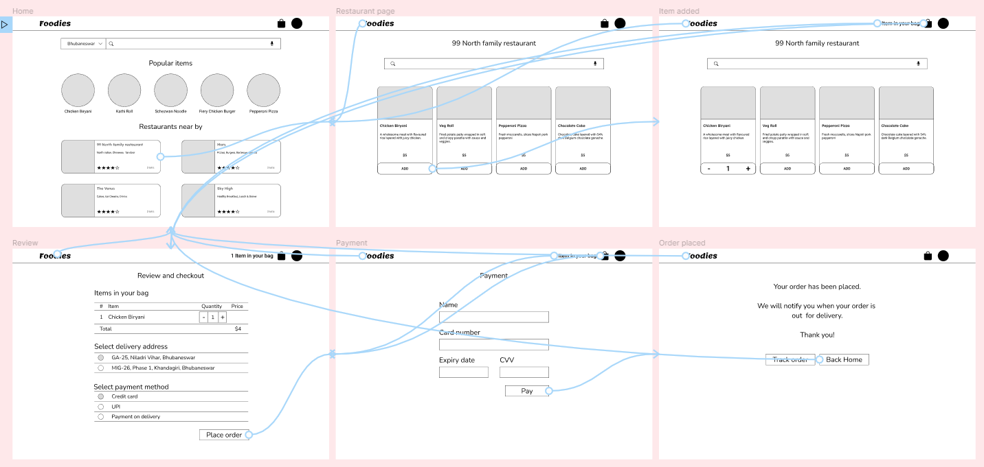
Usability study
I used the high-fidelity prototype for the usability study and it revealed aspects of the designs that needed refining.
Findings
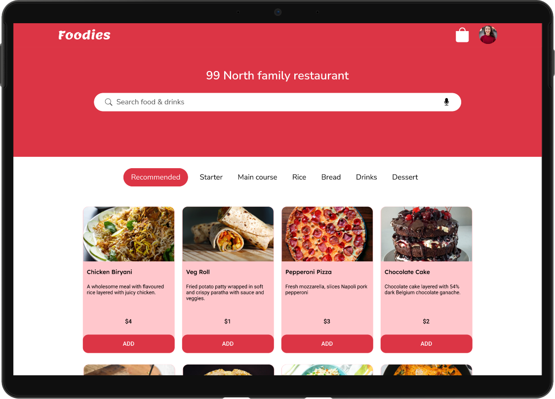
- Menu tab was missing from the restaurant page.
- Important links: Help, Contact and About were missing from the design.
Refining the design
I added the Menu tab and the missing links.
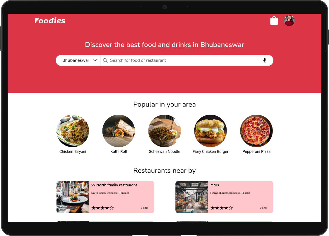
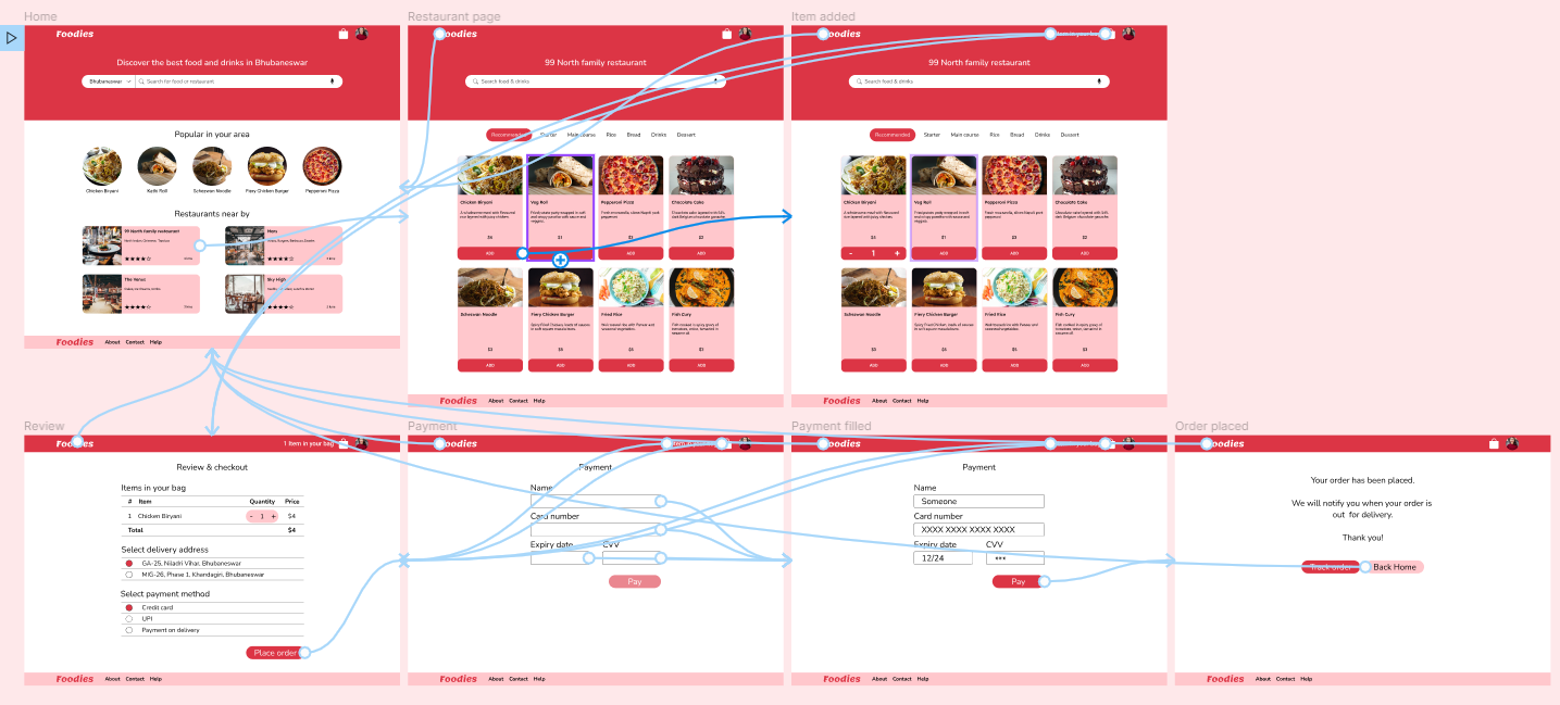
High fidelity prototype
The final high-fidelity prototype presented cleaner user flows for ordering food and checkout. It also met user needs for payment on delivery option.
Accessibility considerations
- Provided access to users who are visually impaired through adding alt text to images for screen readers.
- Used icons to help make navigation easier.
- Used detailed imagery for food items to help all users better understand the designs.
Takeaways
Impact
Users love the web version of the food delivery mobile app.
Quote from peer feedback
"Wow, now I don't have to switch devices to order food while working on my laptop. Big thanks to the Foodies team for thinking about this."
What I learned
While designing this app, I learned that the first ideas for an app are only the beginning of the process. Usability studies and peer feedback influenced each iteration of the app's designs.
Next steps
Conduct another round of usability studies to validate whether the pain points users experienced have been effectively addressed.
Conduct more user research to determine any new areas of need.
Lets connect!
If you’d like to see more or get in touch, my contact information is provided in the footer below.