Overview
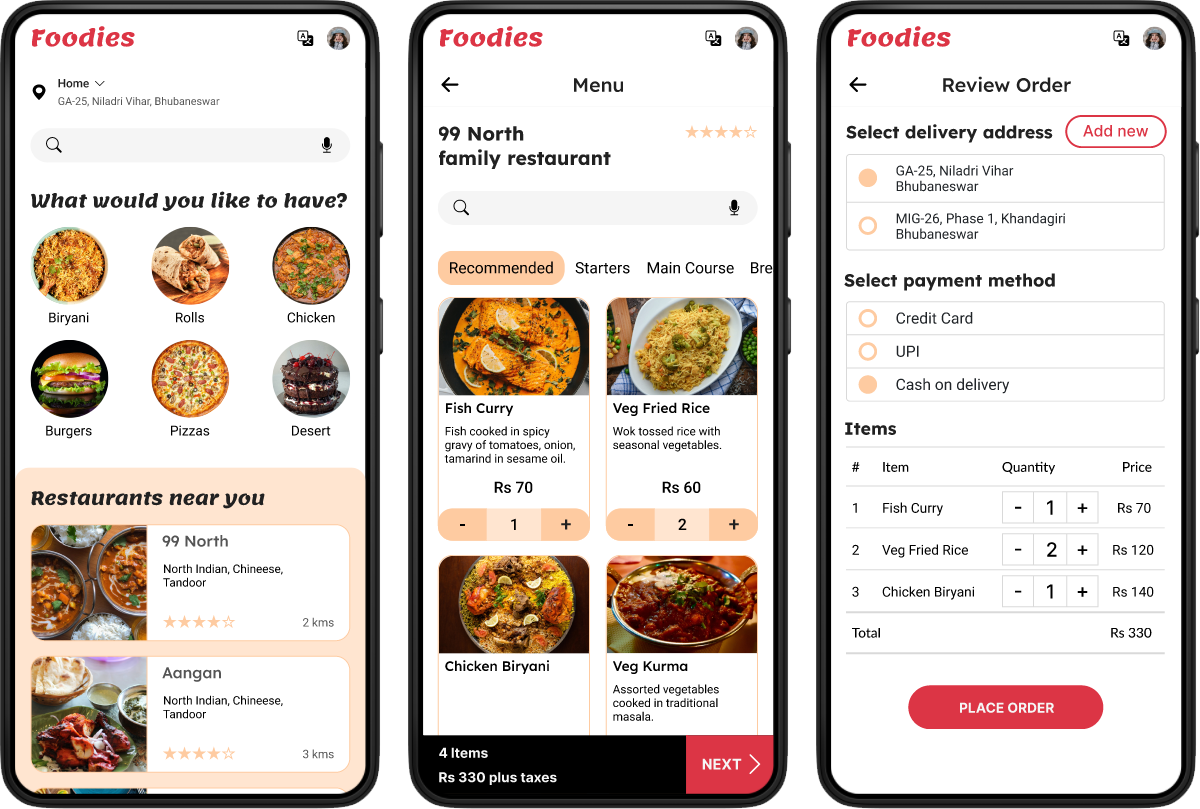
Foodies is a food delivery mobile app. It strives to deliver a wide range of food items from various restaurants. It targets customers who lack the time to prepare meal and helps them order food online and get it at their doorstep.
The Problem
Busy workers and commuters lack the time necessary to prepare a meal.
The Goal
Design a food delivery app that allows users to easily order healthy meals and get it delivered at their doorstep.
My Role
UX designer designing a food delivery app from conception to delivery.
Responsibilities
Conducting interviews, paper and digital wireframing, low and high-fidelity prototyping, conducting usability studies, accounting for accessibility, and iterating on designs.
User research
I conducted interviews and created empathy maps to understand the users I’m designing for and their needs. A primary user group identified through research was working adults who don’t have time to cook meals.
This user group confirmed initial assumptions about potential customers, but research also revealed that time was not the only factor limiting users from cooking at home. Other user problems included obligations, interests, or challenges that make it difficult to get groceries for cooking or go to restaurants in-person.
Pain points
Time
Working adults are too busy to spend time on meal prep.
Accessibility
Platforms for ordering food are not equipped with assistive technologies.
Information Architecture
Text-heavy menus in apps are often difficult to read and order from.
Persona
 Pratyush
- Make time for each of his patients
- To have easy access to healthy food
- Having a busy schedule makes it difficult for him to prepare a meal
User journey map
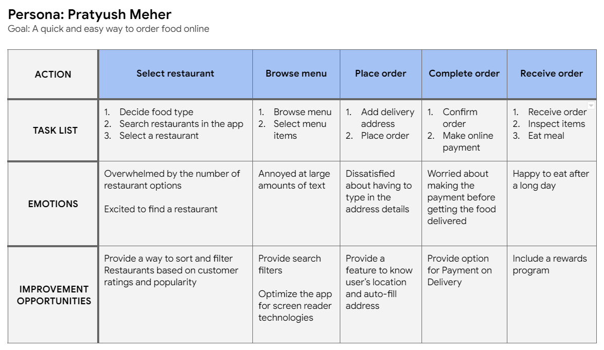
Mapping Pratyush’s user journey revealed how helpful it would be for users to have access to a food delivery app.
Starting the design
Paper wireframes
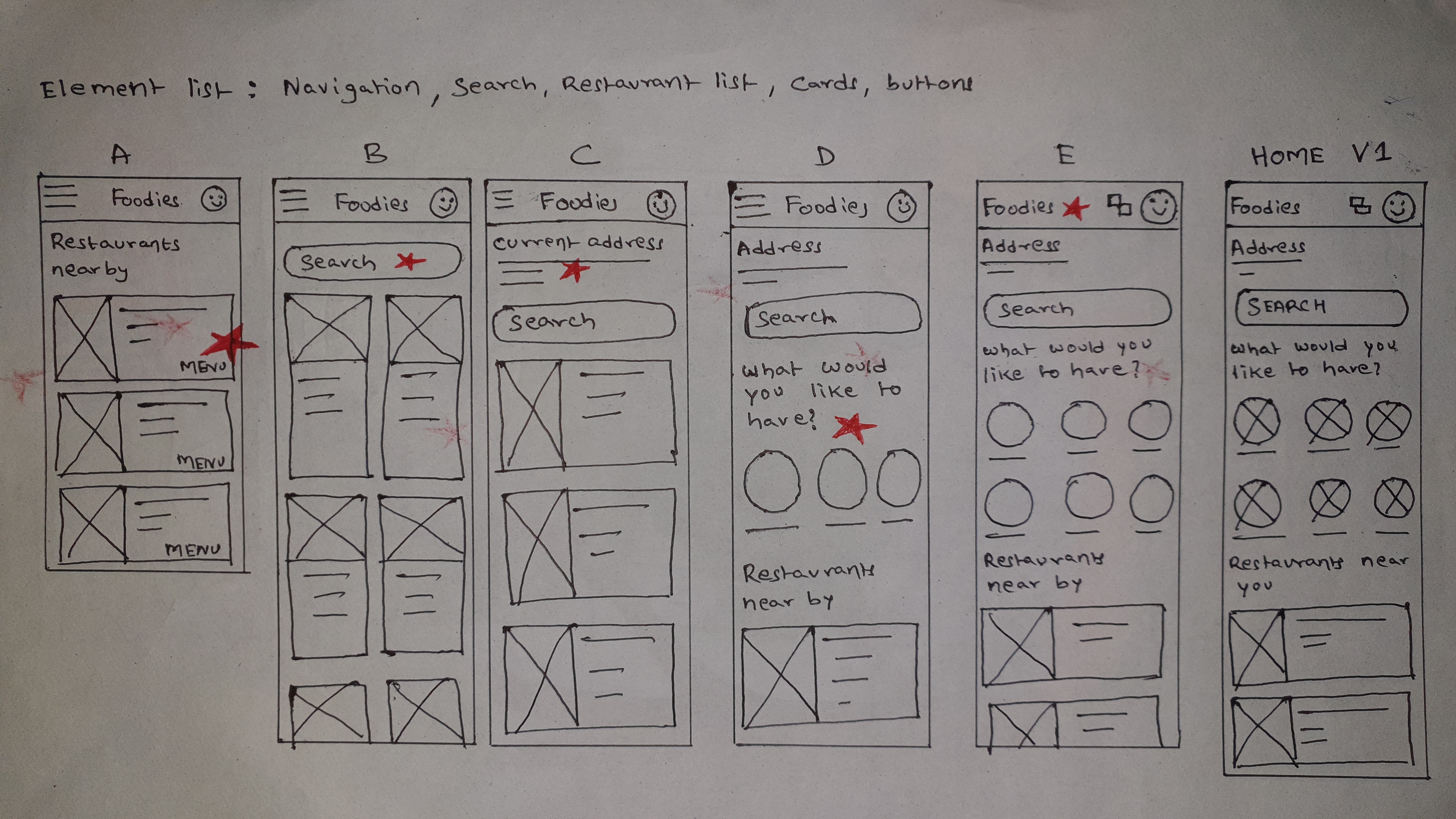
Taking the time to draft iterations of each screen of the app on paper ensured that the elements that made it to digital wireframes would be well-suited to address user pain points. For the home screen, I prioritized a quick and easy ordering process to help users save time.
Digital wireframes
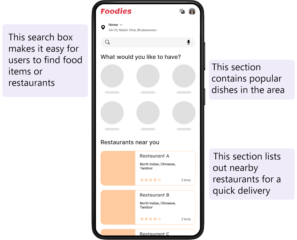
As the initial design phase continued, I made sure to base screen designs on feedback and findings from the user research.
Low-fidelity prototype
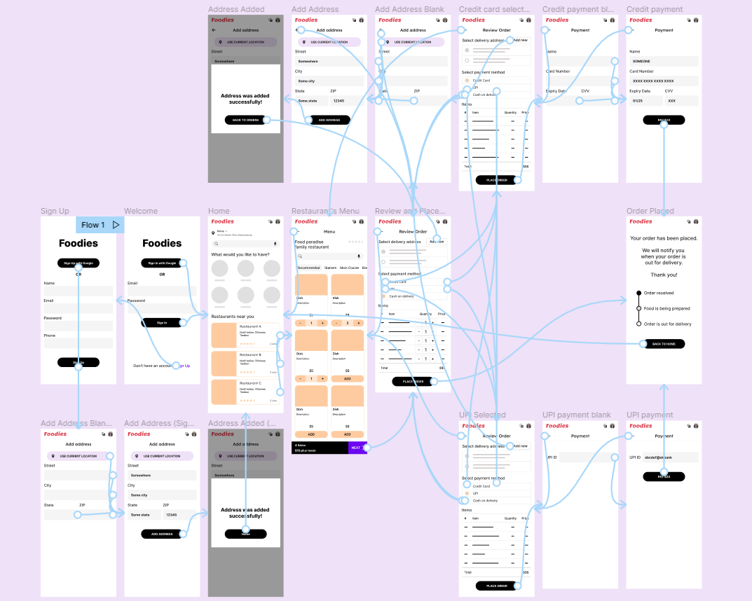
Using the completed set of digital wireframes, I created a low-fidelity prototype. The primary user flow I connected was selecting a restaurant and ordering food, so the prototype could be used in a usability study.
Usability study
I conducted two rounds of usability studies. Findings from the first study helped guide the designs from wireframes to mockups. The second study used a low-fidelity prototype and revealed what aspects of the mockups needed refining.
Round 1 findings
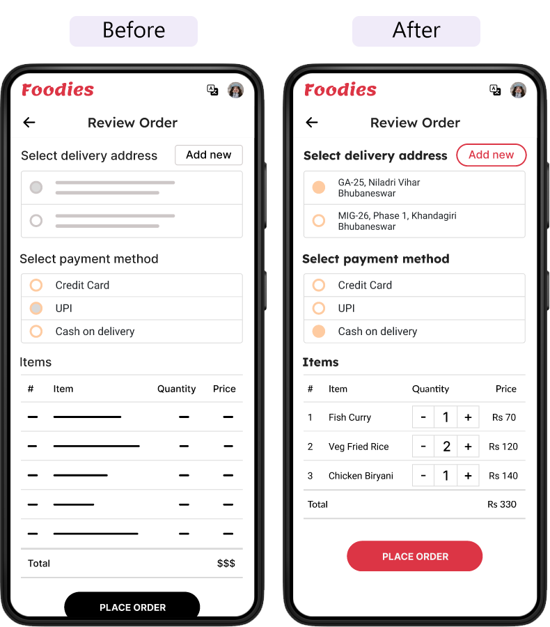
- Users want to be able to edit quantity of food items from the review page as well
Round 2 findings
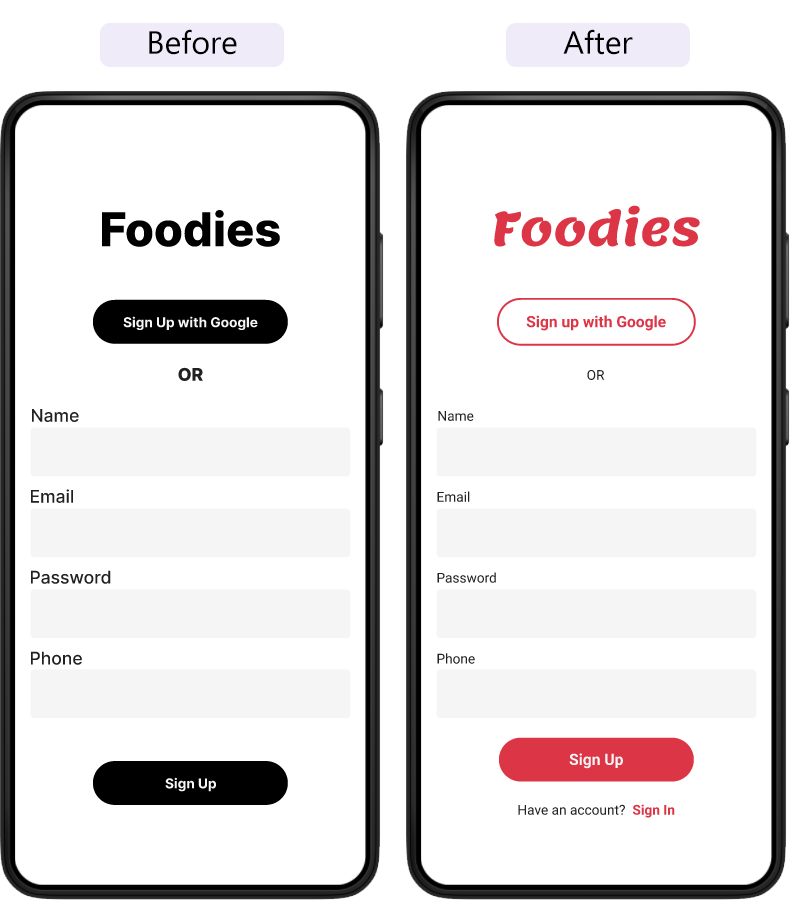
- Sign In link was missing from the Sign Up page
Refining the design
Early designs didn’t have a way to edit quantity from the Review page, but after the usability studies, I updated the Review order page to allow Quantity adjustments.
The second usability study revealed that the Sign Up page didn’t have a Sign In link. Added it.
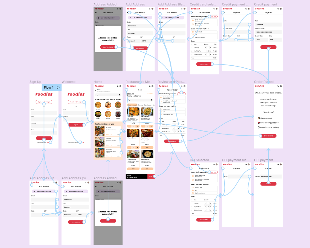
High fidelity prototype
The final high-fidelity prototype presented cleaner user flows for ordering food and checkout. It also met user needs for payment on delivery option.
Accessibility considerations
- Provided access to users who are visually impaired through adding alt text to images for screen readers.
- Used icons to help make navigation easier.
- Used detailed imagery for food items to help all users better understand the designs.
Takeaways
Impact
The app makes users feel the "Foodies" team thinks about how to meet their needs.
Quote from peer feedback
"The app made it so easy to select a restaurant and order food! I would definitely use this app for a delicious, fast, and healthy meal."
What I learned
While designing this app, I learned that the first ideas for an app are only the beginning of the process. Usability studies and peer feedback influenced each iteration of the app's designs.
Next steps
Conduct another round of usability studies to validate whether the pain points users experienced have been effectively addressed.
Conduct more user research to determine any new areas of need.
Lets connect!
If you’d like to see more or get in touch, my contact information is provided in the footer below.