Overview
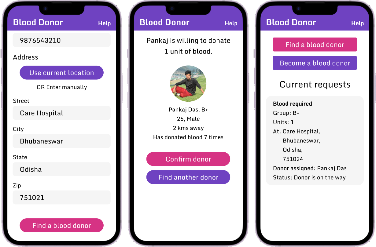
“Blood Donor” is a mobile app designed to help people donate or find blood donors. It targets people who have difficulties finding a blood donor.
The Problem
People have difficulties finding blood donors.
The Goal
Design an app to help people donate or find blood donors easily.
My Role
UX designer designing a blood donation and procurement app from conception to delivery.
Responsibilities
Conducting interviews, wireframing, low and high-fidelity prototyping, conducting usability studies, accounting for accessibility, and iterating on designs.
User research
I conducted interviews and created empathy maps to understand the users’ problems. The primary user group were people who had faced a situation where they needed a blood donor.
Pain points
Finding donors
- Posting on multiple social platforms is tiring, consumes a lot of time and doesn't give a positive response.
- Unable to find donors who are nearby or available.
Availability
Unaware of the availability of blood, travelling to different blood banks is a pain.
Persona
 Nancy
Nancy- To find blood on time
- To find the right blood match
- Easily connect to a donor
- Trouble finding donors
- Unavailability of blood
Starting the design
Wireframes
Low-fidelity prototype
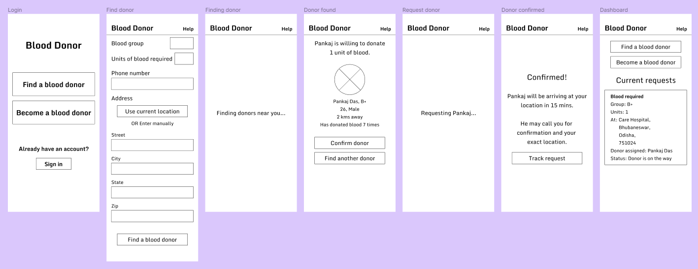
Using the completed set of digital wireframes, I created a low-fidelity prototype. The primary user flow was to find a blood donor. This prototype was used in a usability study.

Usability study
I conducted two rounds of usability studies. Findings from the first study helped guide the designs from wireframes to mockups. The second study used a high-fidelity prototype and revealed what aspects of the mockups needed refining.
Round 1 findings
The design didn’t include a sign-in process for recipients to help find a blood donor fast. Because of this, users couldn’t track their requests after closing the app.
Round 2 findings
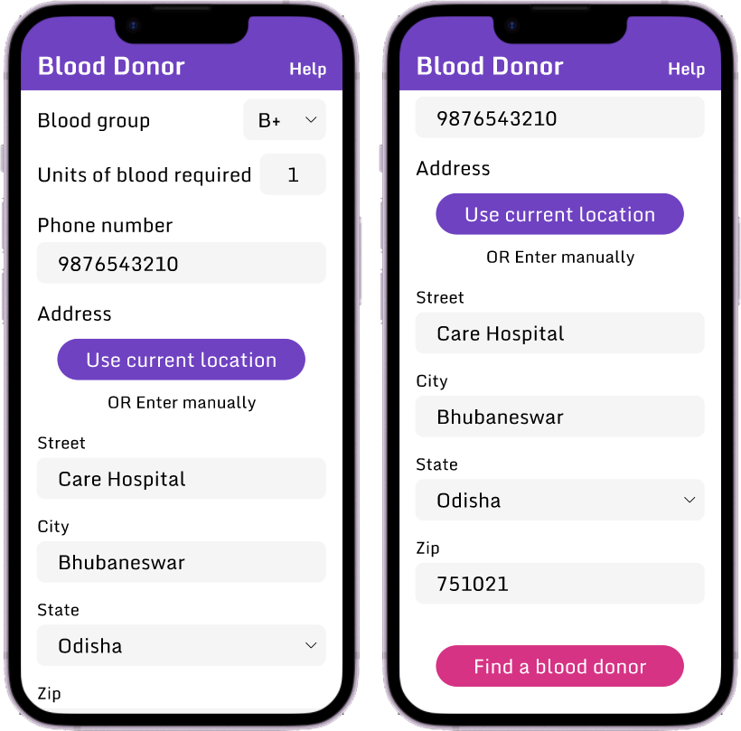
The “blood group” and “state” appeared to be text input fields which should have been dropdown menus.
Refining the design
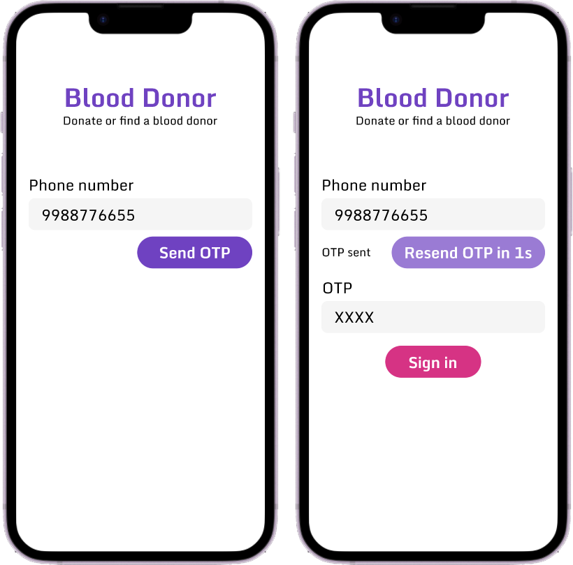
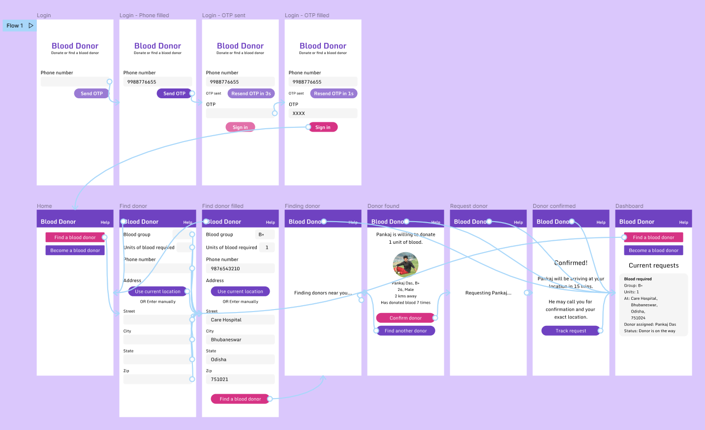
I added a simple phone number and OTP sign-in process to help users track their requests.
I added icons to make “blood group” and “state” appear like dropdown menus.
High fidelity prototype
The final high-fidelity prototype presented cleaner user flows for finding a blood donor.
Takeaways
Impact
The app makes users feel the "Blood donors" app does a nice job finding a blood donor.
Quote from peer feedback
"The app made it so easy and quick to find a blood donor. I would definitely use this app."
What I learned
While designing this app, I learned that the first ideas for an app are only the beginning of the process. Usability studies and peer feedback influenced each iteration of the app's designs.
Next steps
Conduct another round of usability studies to validate whether the pain points users experienced have been effectively addressed.
Conduct more user research to determine any new areas of need.
Lets connect!
If you’d like to see more or get in touch, my contact information is provided in the footer below.